03. Bar Charts
L3 031 Bar Charts V3
DataVis L3 03 V2
Bar Charts
A
bar chart
is used to depict the distribution of a categorical variable. In a bar chart, each level of the categorical variable is depicted with a bar, whose height indicates the frequency of data points that take on that level. A basic bar chart of frequencies can be created through the use of seaborn's
countplot
function:
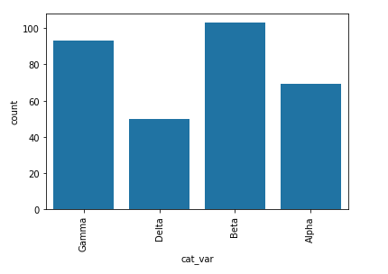
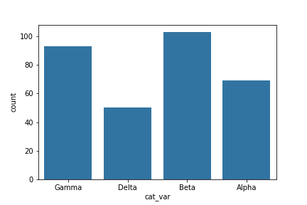
sb.countplot(data = df, x = 'cat_var')
For the example given, you can see that the Beta level has the highest frequency at over 100 counts, followed by Gamma and Alpha, with Delta the least frequent at around 50. By default, each category is given a different color. This might come in handy for building associations between these category labels and encodings in plots with more variables. Otherwise, it's a good idea to simplify the plot and reduce unnecessary distractions by plotting all bars in the same color. This can be set using the "color" parameter:
base_color = sb.color_palette()[0]
sb.countplot(data = df, x = 'cat_var', color = base_color)
color_palette
returns a list of RGB tuples. Each tuple consists of three digits specifying the red, green, and blue channel values to specify a color. Calling this function without any parameters returns the current / default palette, and we take the first color to be the color for all bars.
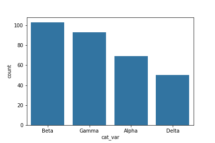
One thing that we might want to do with a bar chart is to sort the data in some way. For nominal-type data, one common operation is to sort the data in terms of frequency. With our data in a pandas DataFrame, we can use various DataFrame methods to compute and extract an ordering, then set that ordering on the "order" parameter:
base_color = sb.color_palette()[0]
cat_order = df['cat_var'].value_counts().index
sb.countplot(data = df, x = 'cat_var', color = base_color, order = cat_order)
(Documentation:
Series.value_counts()
)
For ordinal-type data, we probably want to sort the bars in order of the variables. While we could sort the levels by frequency like above, we usually care about whether the most frequent values are at high levels, low levels, etc. The best thing for us to do in this case is to convert the column into an ordered categorical data type. By default, pandas reads in string data as object types, and will plot the bars in the order in which the unique values were seen. By converting the data into an ordered type, the order of categories becomes innate to the feature, and we won't need to specify an "order" parameter each time it's required in a plot.
# this method requires pandas v0.21 or later
level_order = ['Alpha', 'Beta', 'Gamma', 'Delta']
ordered_cat = pd.api.types.CategoricalDtype(ordered = True, categories = level_order)
df['cat_var'] = df['cat_var'].astype(ordered_cat)

# # use this method if you have pandas v0.20.3 or earlier
# df['cat_var'] = df['cat_var'].astype('category', ordered = True,
#                                      categories = level_order)

base_color = sb.color_palette()[0]
sb.countplot(data = df, x = 'cat_var', color = base_color)
(Documentation: CategoricalDtype )
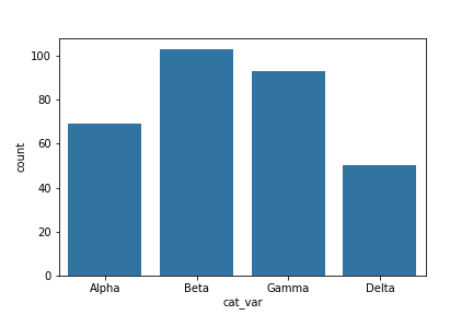
Should you find that you need to sort an ordered categorical type in a different order, you can always temporarily override the data type by setting the "order" parameter as above.
Additional Variations
If your data is in a pandas Series, 1-d NumPy array, or list, you can also just set it as the first argument to the
countplot
function, as we do with the Series
data_var
here:
sb.countplot(data_var)If you have a lot of category levels, or the category names are long, then you might end up with overcrowding of the tick labels. One way to address this is through creation of a horizontal bar chart. In a horizontal bar chart, it is the length of each bar that indicates frequency, rather than the height. In the code, instead of setting the data or variable on the "x" parameter, you can set the variable to be plotted on the parameter "y":
base_color = sb.color_palette()[0]
sb.countplot(data = df, y = 'cat_var', color = base_color)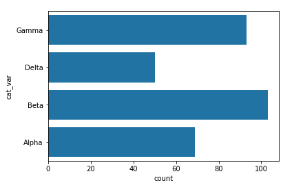
Alternatively, you can use matplotlib's
xticks
function and its "rotation" parameter to change the orientation in which the labels will be depicted (as degrees counter-clockwise from horizontal):
base_color = sb.color_palette()[0]
sb.countplot(data = df, x = 'cat_var', color = base_color)
plt.xticks(rotation = 90)